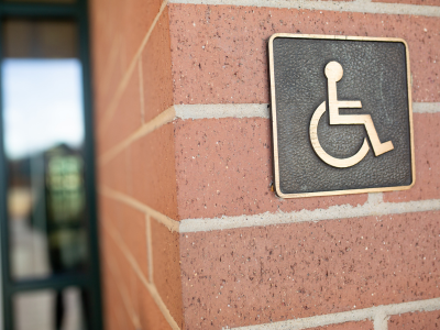
The Americans with Disabilities Act (ADA) is a law that was passed in 1990 to help protect the rights of people with disabilities. ADA dictates many aspects of the public world, including how many accessible parking spaces a parking lot must have, whether service animals are allowed in businesses, and how accessible businesses must be to people who use mobility devices.
If you’re making an ADA-compliant sign for your business, you must use ADA-compliant fonts, incorporate Braille text, use proper contrast, and more. Below are some of the things you’ll need to do to ensure that your sign is ADA-compliant.
1. ADA-Compliant Fonts
ADA-compliant fonts are fonts that lack embellishments and are easy to read. Some of the most commonly accepted ADA-compliant fonts include Helvetica, Arial, and Verdana. Many of the compliant fonts are sans serif, although Times New Roman is also ADA-compliant.
Italic fonts, scripts, and fonts that are highly decorative for whatever reason are not compliant because they favor look and style over readability. When seeking a font that’s compliant, it’s important to consider the case, spacing, and size of the font. The words must be easily readable by the audience. Letters that are crowded together or are too small are not compliant. ADA guidelines are very specific on how these parameters are measured.
2. Braille Text Incorporated
Braille helps people with visual impairment navigate your building. Corresponding Braille text is required on signs that identify a permanent room or space. Federal guidelines specify the shape of the raised dots, the height of the dots, the dot base diameter, the distance between the dots within the same cell, the distance between the cells, and the distance between cells directly above and below each other.
State requirements for these specifications can vary, so it’s important to work with a sign maker who is familiar with these differences.
3. High Level of Contrast
A high level of contrast on interior signage is important for ensuring readability. The contrast is the way that one color stands out from the other. Consider how black writing appears on a dark blue background. This color combination is low contrast and difficult to read. Black writing on white, however, is high contrast.
Not all interior signage needs to be black and white in order to be compliant. Generally speaking, a 70% contrast is usually considered acceptable. This percentage is derived from the “light reflectance value” (LRV), where pure black is measured at 0%, and pure white is measured at 100%. All colors are assigned an LRV, and the best contrast is found in color combinations with at least 70 points of difference between them.
4. Non-Glare Finishes
Glare is created when light bounces off of a sign. This can make reading and processing visual information difficult for people with visual impairments. Matte and eggshell finishes are low-glare and are acceptable on ADA-compliant signs.
5. Correct Placement
Signs must be mounted in intuitive locations where people expect to see them. For example, a sign that designates the function of a room should be mounted beside the door.
Navigating the rules of ADA compliance when it comes to signs can be challenging. Working with an experienced sign maker can simplify the process. Want more information? Contact ABC Signs today.
 What You Need to Know About Signage Fabrication