
Signs are made to be looked at. One of the ways that sign makers help ensure that their signs will get attention is by making smart decisions about their design. Everything from the size and shape to the graphic images that you see on a sign impacts whether that sign gets attention and if so, just how much. Design elements impact the functionality of a sign and the message it conveys. Below are just a few ways that design elements can be manipulated to make a sign more effective.
Size and Location
Size and location play an important role in quickly grabbing prospective customers’ attention, thus these are the first design elements that need to be decided upon when making a sign.
Who will be viewing the sign? Will they need fast recognition as they drive past? The sign must be large and the message simple. Will they be walking slowly by? A small size may be appropriate, but take into consideration the location where the sign will be hung. A sign that is high on the wall or hung over a walkway must be larger than one that is posted at eye level.
Color Contrast
Color contrast is essential for designing signs. High contrast colors make messages easier to read, especially from a distance. High contrast colors are also important for accessibility. People with low vision need high contrast signs to get the maximum benefit. This is especially important to take into consideration in locations where the public must be able to use the signs, and in locations where signs are a matter of safety.
While black and white are traditional high contrast colors, there are other color combinations to consider. Most dark colors on light, neutral backgrounds are high contrast enough. Yellow and purple, yellow and black are also high contrast colors that bring color to your signs.
Human Element
Eye-tracking studies have identified elements that enhance the visibility and attention of graphics. Incorporating faces, including headshots of people, attracts attention and can be impactful in sign design. People tend to look faces in the eye and make connections between themselves and others on signs.
Other Graphic Elements
Graphic elements aside from faces can draw attention to signs, and some visual aids can make signs more effective. However, it’s important to avoid making signs cluttered or busy. Too many graphics can create visual noise that makes signs hard to read.
To ensure effective visuals and designs, it’s important to consult experts who understand the science of visibility and the creativity of design. Working with a professional sign company can help ensure that your signs will be as effective as possible.
Maximize the Potential of Your Signs – Contact the Professionals
ABC Signs, in Cincinnati OH, makes effective signs for businesses of all kinds. Contact us today to make an appointment and learn more about making an effective sign for your business.
 Springtime Signage: Letting Your Business Bloom
 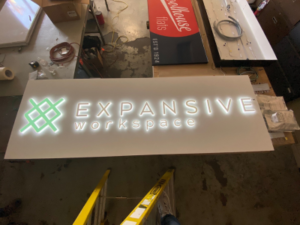 Why You Should Consider an Illuminated Sign for Your Business
  Marketing Benefits of Business Signage
  Different Types of Signage for Business Growth