Proper Signage Tips For Optimal Visibility
Simply put, the larger the letter, the easier it is to read. This is especially important if you’re creating roadside signage or signs that will be displayed at a significant distance. And not only that, but there are several other factors to consider when designing a proper sign for maximum visibility. Check out our list of top considerations before creating your next sign.
Letter Visibility
ABC Signs’ Letter Visibility Chart shows the maximum reading distance for your sign to make the best impact, as well as the overall readable distance. A good rule of thumb is every 1 inch of letter height provides 10 feet of readability with the best impact. For example, 3” tall letters make the best impact within 30’; however, they can still be seen and read from up to 100’ away.
| Letter Height (Inches) |
Distance For Best Impact (feet) |
Maximum Readable Distance (feet) |
| 3″ | 30′ | 100′ |
| 4″ | 40′ | 150′ |
| 6″ | 60′ | 200′ |
| 8″ | 80′ | 350′ |
| 9″ | 90′ | 400′ |
| 10″ | 100′ | 450′ |
| 12″ | 120′ | 525′ |
| 15″ | 150′ | 630′ |
| 18″ | 180′ | 750′ |
| 24″ | 240′ | 1000′ |
| 30″ | 300′ | 1250′ |
| 36″ | 360′ | 1500′ |
| 42″ | 420′ | 1750′ |
| 48″ | 480′ | 2000′ |
| 54″ | 540′ | 2250′ |
| 60″ | 600′ | 2500′ |
Sign Location
When designing your sign, consider how you will be using it, as well as how far away the readers you want to impact will be.
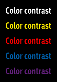
Color Scheme
Ease of reading is greatly affected by the contrast between background and foreground. The greater the contrast, the better the readability. Remember that the environment in which the sign will be displayed is another contrast factor to consider.
Font Type
The font type that you choose can also impact the visibility of your text. Very thin fonts and script fonts can potentially decrease visibility. When choosing fonts, you should select a bold style that is easy to read and sufficient spacing between letters
When designing custom signs, trust the experts at ABC Signs to help design, fabricate & install! Contact us to get a FREE estimate.