Sign Contrast and Color
Contrast and Color
Color and contrast are very important elements in the effective communication of your message. While colors tend to convey different messages or feelings, they also work in various ways to provide contrast together.
Sign Contrast
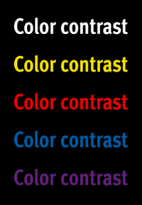
Ease of reading is greatly affected by the contrast between background and foreground. The greater the contrast, the better the readability. Remember that the environment in which the sign will be displayed is another contrast factor to consider.
Contrast Examples
- Black sign background – lettering will stand out more than on other background colors, but the background can be overwhelming if the lettering is small. A good choice for office building signs, visually overwhelming environments, hotel signs, and indoor signs.
- White sign background – most effective for most color combinations. It tends to absorb its environment so it is best with lower contrast lettering. A good choice for museums, offices, retail signs, and hospital signs.
- Yellow sign background – ideal for use in busy and crowded settings. Yellow with black lettering is an especially effective combination. A good choice for direction signs, public signs, and signs in visually cluttered environments.
Sign Colors
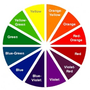
A commonly used reference for color compatibility selection is the color wheel. It shows colors divided into primary colors and secondary colors, and also shows complementary colors:
- Primary colors:
Blue, Red, Yellow - Secondary colors:
Green, Orange, Violet - Complementary colors:
Red–Orange, Red–Violet, Yellow–Orange, Yellow–Green, Blue–Violet, Blue–Green
Examples of Common Color Associations
- BLACK – elegant, formal, powerful
- WHITE – light, pure, clean
- RED – assertive, strong, determined
- YELLOW – joyful, happy, energetic
- BLUE – trust, wisdom, calm
- GREEN – fresh, environmental, relaxed